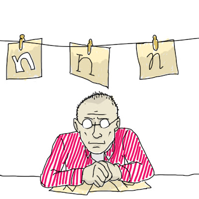
a look at Erik Spiekermann's typeface for Nokia
"Well, like all letters, the important thing is that you don’t actually design the black, you design the white: the space inside it and the space around it." - Spiekermann on screen fonts (PingMag 2005)
Erik Spiekermann has been a prominent figure in the design world for quite some time. He is well-known for his plain-spoken expression as well as his deep understanding of how typefaces work. Spiekermann's most recent clients include Mozilla, to whom he co-created the Fira Sans mainly for the use in Firefox OS.
Spiekermann also happened to create a family of typefaces for Nokia. This Nokia Sans family of letters spent almost ten years on Nokia's product packaging, advertisement and most notably mobile phone screens. The high contrast property was the key aspect in making letters readable on low-resolution screens. This could be considered to be one of the very first examples of "mobile first" -design.
Nokia updated (or downgraded, depends which way you want to look at it) their font during the pressuring tides that took place in the early years of the 2010s. They switched their corporate typeface to Nokia Pure designed by Dalton Maag, completely forgetting about Spiekermann's Nokia Serif typeface as well as the rest of the enormous body of work he had laid out for Nokia almost ten years ago.
What does PhoneSplurt think? Obviously we favor Spiekermann's efforts, since on low-cost models like the Nokia 105 where display resolution is low, the Nokia Pure doesn't really deliver an experience of using a Nokia phone the instant you pick it up. On the other hand, the Nokia Pure goes nicely in line with the Microsoft Windows Phone user interface, which is bland in itself as well.
Some connection to Apple's recent switch in iconography can be made as well. The signature, distinguishable "skeuomorph" icons were replaced by icons that don't engage in much conversation with the user.
These events alongside today's topic of this particular Nokia typeface-downgrade left us worried about a fundamental problem in the design industry. Is everything going to be bland eventually? Is generic minimalism going to become a standard that suppresses design styles that pack a punch?
Sources & links:
Erik Spiekermann's blog, discussing Nokia typeface change
GSMArena.com on Nokia facelift
Erik Spiekermann's interview on PingMag
Dalton Maag on Nokia Pure development


No comments:
Post a Comment